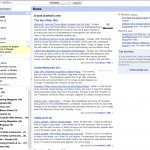
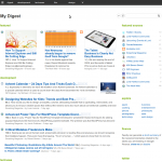
First of all, I must admit that I’ve never been a big user of Google Reader. However, the other day, I discovered feedly when they released their plugin for Google Chrome. Feedly is a really nice feed reader, but it’s more than that. For one, feedly is actually integrated with Google Reader, so that any new subscriptions you add in Reader are automatically pulled into feedly and vice versa. Therefore, for everyone that’s actively using Reader, you can easily try out feedly without having to migrate anything over.
Following are some of the features I like about feedly:
- The layout is really attractive (compared to the extremely utilitarian, ugly, standard-Google interface of Google Reader). Almost every article includes an image of some sort, even if it’s a default image. The layout resembles an online magazine more than an e-mail client.
- There are multiple options on how you want to view your list of articles. They offer the “cover,” which shows all of your feeds sort of mixed together, the “digest,” which shows your feeds split up into your categories on a single page or you can view each category and/or feed separately.
- Adding a feed is really easy. To start, you click “add source” and enter the address of the feed. You can easily categorize or tag the new feed while you’re adding it. You then get to preview the feed to make sure it’s really what you want and that it’s working properly. After you’ve previewed the feed, you can add it to your feedly account.
- Sharing is simple. Each article in your feed includes an icon to share or save the article on Twitter, through e-mail, del.icio.us, Facebook, Google Reader, Posterous, Evernote, Instapaper and ping.fm. You can also share the article through feedly (recommending it to other users) or mark it to be saved for later.
- If you really want to share your feeds, you can even make one of your categories public and embed it in an iFrame (I would embed it below, but WordPress seems to automatically remove iFrames from posts, unfortunately).
- Feedly is able to dynamically switch between widescreen and standard layout. When viewing in a wide browser, much of the menu items are in a sidebar on the left side. If you resize your browser to a standard layout, the menu automatically moves to the top of the screen rather than a sidebar.
Following are side-by-side screen captures of feedly and Google Reader:
Give it a try (currently available for Firefox and Chrome) and let me know what you think.


Post Your Comment