 Google officially released the first beta version of their browser today. The browser is called Chrome, and is intended to go head-to-head with Microsoft’s Internet Explorer (then again, what browser hasn’t been released with that goal in mind?).
I have downloaded and installed Chrome on my Vista machine at home, and am writing this post from within Chrome right now. I have to say that, at first glance, I am extremely impressed at how little screen real estate the browser’s window takes up. If all browsers were to take a note from Google’s browser, visitors’ screen resolutions might actually start to mean something.
As it stands, a Web page viewed in 800 x 600 resolution actually has to take up approximately 740 pixels in width, and only about 400 pixels will actually fit vertically, because of the browser’s chrome. Activate the “bookmarks” tab within Firefox or IE, and your Web page real estate gets even smaller.
Google, however, has taken a different approach.
The status bar is hidden at the bottom of the screen, and only appears when it has something important to share with the user. When maximized, the tab bar is built into the title bar, so that it takes up no more vertical space than the title bar does in any other browser. When the browser is not maximized, the tab bar shows up just below where the title bar should be.
Upon default installation, only two toolbars are displayed at the top of the browser. One of them includes the address bar, the “page” menu and the config menu (both of which are simply icons that dropdown into menus). The other toolbar is the bookmarks bar. That can easily be hidden by pressing Ctrl+B.
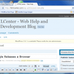
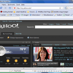
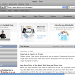
Below, you can see screen shot comparisons of IE 7, Firefox, Opera, Safari and Chrome, all set to approximately the size they would be if they were maximized on an 800×600 display.
- Chrome – Google’s New Browser
- Firefox 3
- Internet Explorer 7
- Opera 9
- Safari
Most Visited
One other thing I noticed about Chrome, is that Google has implemented a feature similar to Opera’s “speed-dial” that shows up on each empty tab. In Opera, you can set up to nine “speed-dial” pages, which are like your favorite bookmarks. When you add a page to your speed-dial page, a screen shot is captured and displayed along with the bookmark.
However, unlike Opera’s speed-dial feature, Chrome’s items are populated automatically, based on the pages you visit most often. The “most visited” page in Chrome also shows a list of pages you have recently bookmarked, along with a search engine.
Installation
Installaion is a breeze. You start by downloading a very small installation file, open it up, and Chrome automatically downloads and installs on your computer. Once it’s installed, Chrome will automatically import all of your bookmarks, passwords and more from your default browser.
Conclusion
All in all, I think it’s a nice browser. Of course, only time will tell how well it holds up and how well it conforms to W3C standards. However, for those of you that like to try different browsers, this one’s definitely worth a download.


2 Responses
Even i too installed Google Chrome yesterday and found it really interesting and satisfactory.
Regards
Web Development Company
http://www.saturn.in
[…] case you missed the article posted by Curtiss, Google Releases a Browser | HTMLCenter – Web Help and Web Development Blog __________________ Like my spiffy, unique signature? […]